 I am in the process of updating HTML5Accessibility.com
(ETA mid September) to take into account the changes in accessibility
implementation support in the latest browser versions. I have decided not to update
support information for Safari/Webkit on Windows and Opera on Windows
or Mac as these browser/OS combinations show no sign of active
HTML accessibility implementation support. If and when they do, I will
do detailed tests of theses browsers once again.
Internet Explorer 10 on Windows 8 meanwhile, includes implementation of a number of new HTML5 features and improved accessibility support for other features.
new HTML5 feature accessibility support in IE 10
The progress element
Default display of the progress element in IE 10 on Windows 8
code example
<progress value="30" max="100">30%</progress>
As implemented the progress element exposes the appropriate accessibility information via the MSAA and UI automation accessibility APIs.
input type=range
Default display of input type=range (slider) element in IE 10
code example
<input type="range" max="11" min="0" value="7">
As implemented the input type=range element exposes the appropriate accessibility information via the MSAA and UI automation accessibility APIs. It supports operation with the keyboard using the up/down/left/right arrow keys (incremental) or via the home and end keys (minimum/maximum).
current value is displayed as a tooltip when the user drags the slider thumb with the mouse
As illustrated above, a tooltip is displayed displaying the current slider value, but only when using a mouse, not when using the keyboard.
The datalist element
Default display of the datalist element in IE 10
code example
<input type="text" list="mylist">
><datalist id=”mylist”>
<option value="Miss" label="Miss"></option>

<option value="Mr" label="Mr"></option>

<option value="Ms" label="Ms"></option>

<option value="Mad Professor" label="Prof"> </option>

</datalist>
As implemented the datalist element when associated with a text input , turns it into a ComboBox. It exposes some of the appropriate accessibility information via the MSAA and UI automation accessibility APIs. The presence of the list is not indicated via the role, state or properties of the input element, but the list and list items are exposed correctly. It supports operation with the keyboard: the list is displayed when the text input receives focus, the up/down arrow keys can be used to navigate the list items and the enter key selects a list item. A quick test with Narrator (built in Windows 8 screen reader) did not reveal any information being announced about the list or the list item and no indication about the presence of the list.
the required attribute
A message is displayed when a user submits a form without filling in required fields.
code example
<input type="text" required>
The required attribute is supported for visual users only. When an input that is required is not filled in by a user and the form is submitted, a red border appears around the input and a message is displayed (side note: the message is built using SVG). Note further, this occurs for each input that is in error, not only for the first input in the form, which is the current (not very useful) behaviour for other browsers that support required by displaying a message (e.g. Opera and FireFox). There appears to be no accessibility information reported via either MSAA or UI automation. A quick test with Narrator did not reveal any information being announced about required fields or their state.
the audio element
audio element user interface
code example
<audio controls></audio>
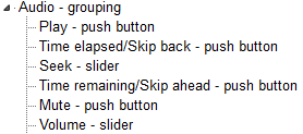
The audio element has full keyboard and accessibility information support including accessible name, description, and accessKey information. Each control can be navigated to and operated using the keyboard.

Accessibility tree representation of the audio element in IE 10
Accessibility tree representation of the audio element in IE 10
the video element
video element user interface with volume slider displayed.
code example
<video controls></video>
The video element has full keyboard and accessibility information support including accessible name, description, and accessKey information. Each control can be navigated to and operated using the keyboard. Note the volume slider is represented in the accessibility tree, but is activated by focusing on the mute button then using the up/down arrow keys to modify the volume level.
Accessibility tree representation of the video element in IE 10
The placeholder attribute
The placeholder attribute value is used as the accessible name for the control if no other accessible name is provided. So from the placeholder attribute test page, only in the first test is the placeholder text used, otherwise it is not exposed in the MSAA or UIA accessibility APIs.
code example
<input type=text placeholder="poot">
Conclusion
Microsoft are doing things well in many respects, but there are gaps. I particularly like the audio and video implementations which make it much easier for keyboard users to operate the controls without having to remember keyboard shortcuts. It is unfortunate though that each browser that supports accessibility and supports the placeholder attribute has implemented its use in accessible name calculation differently, its a an interoperability nightmare for developers and users.
